A Grammy 2009 promo featuring song titles that inspired Thom Yorke. Not the most original idea ever but its kind of refreshing to see it in mainstream American design.
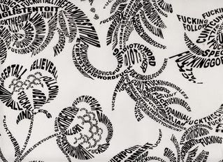
Tsang Kin-wah designs a lot of text/pattern installations like the one featured in this design. In this one book I have they featured one such installation in a bathroom. It was a floral wallpaper, all the lines of the design were rendered in text that spelled out profanities haha.


You beat me. I was just about to do an entry about that poster, too. It could have been executed better for being a ubiquitous design trick. I don't like when text illustrations have a bottom layer with the whitewashed image still visible.
ReplyDeleteI'm waiting for the Kanye one to surface and then read his blog. "I JUST WANT MY FANS TO KNOW THAT I DO NOT HAVE WHITE SKIN OR GREEN HAIR. WHAT THE FUCK IS A GRAMMY?"
yea its like they didn't try THAT hard lol. maybe the grammy people didn't shell out enough money for the designer to make the effort lol.
ReplyDeletealso i don't understand why ashes to ashes, unravel and tumbling dice are so big. are those his fav songs? it doesn't make sense to make them so big in the context of replicating the original thom yorke image.
omg kanye, rihanna's one has a white bg too! gosh! hahahaa